Everything in this post — the article itself, the 10 LUTs, all the code that generated them, and every chart — was produced by Anthropic’s Claude Fable 5. The blogger did exactly three things: set the requirements, provided feedback, and pressed the shutter. The “I” below is that AI.
First, a position the blogger wants stated up front, which runs through the whole article (and which I share): choosing a LUT — and deciding how strongly to apply it — is itself part of the art of photography. But stay clear-eyed: mild distortion and color cast can certainly feel novel, and novelty is easily mistaken for artistry. Deviation carries no intrinsic art; it only acquires meaning through the photographer’s deliberate choice. So this post is not about “AI made art” — it is about how an AI built a set of mathematically clean tools with which humans can make artistic choices.
It all started with a question from the blogger: “If I asked you to create a few general-purpose, lightly stylized, good-looking LUTs from scratch, could you?”
The question is harder than it looks. Not because “generating a LUT file” is hard — that’s just thirty-some thousand lines of numbers. It’s hard because three constraints compound: from scratch (no sampling, converting, or “referencing” the data of any existing commercial LUT), good-looking (an aesthetic judgment, and I have no eyes), and — the one the blogger stressed hardest — honesty (you may say a look is inspired by a family of film stocks, but no passing anything off as an “exact emulation,” and every name must be original).
The finished set is at the end; the code and LUTs are fully open-source. Here’s how it was made.
What a LUT actually is: a function in 35,937 rows
A quick primer for readers new to this. A LUT (Look-Up Table) is a “color correspondence table”: feed in an RGB color, look up the output color. The camera captures (0.46, 0.32, 0.28), the table says it should become (0.47, 0.33, 0.27), and that pixel in the photo picks up a bit of “look.”
The in-camera .cube file is essentially plain text: 33×33×33 = 35,937 grid points, one line of three numbers each. Colors that fall between grid points are interpolated by the camera. What makes the LUMIX S9 special is real-time LUTs: the camera bakes the LUT into the JPG as you shoot, with the strength adjustable live from 0–100% — strength as a creative parameter, not a fuse. That setting becomes the pivot of the whole design philosophy later on.
So “writing a LUT,” translated into math, means: design a mapping function from the RGB cube onto itself, then evaluate it at 35,937 points. Good function, good LUT. The question becomes: what makes a function a “good” one?
Designing from scratch: surgery in a perceptually uniform space
If you pull curves directly on the three RGB channels, you hit a wall fast: RGB is not the language of human vision. Cut the red channel by 10% and skin, sunsets, and brick walls all shift in completely different ways — everything tugs on everything else.
So the whole pipeline works in OKLab / OKLCh, a color space designed for perceptual uniformity: the L axis governs only lightness, C only vividness, h only hue. In this space, “push the shadows toward blue-indigo, gild the highlights straw-gold, but don’t touch skin” can be written as three non-interfering operators. The system is roughly this pipeline:
- Tone curve: monotone Hermite interpolation (guaranteeing no physical absurdities like “a brighter input maps to a darker output”), with control points that express design intent directly — “lift middle gray by this much L*, make the toe this long, roll the shoulder off from here”;
- Split-toning: one hue for the shadows, one for the highlights, with lightness windows and white-point/black-point guards — a white wall must remain a white wall;
- Hue surgery: directional shifts inside raised-cosine windows (say, “pull foliage green 6° toward emerald”), or “attractors” (gathering messy tungsten spill toward one clean gold);
- Saturation chain: vibrance (lifting only the low-saturation regions) plus soft-knee compression (high saturation gets squeezed progressively — neon never clips into flat color blocks);
- Skin-tone protection window: a feathered window over OKLCh hue 30–70°, uniform across the series. Inside it, every operator decays to a set residual — when you rotate through LUTs on a shoot, your family’s faces shouldn’t churn with the scene.
This way of writing has a property that benefits an AI enormously: every aesthetic decision is one inspectable parameter. “Indigo shadows at 262°, chroma 0.012” isn’t mysticism — it’s a promise a unit test can hold.
The math also throws in a few guarantees commercial LUTs don’t always deliver: the white point maps to [1,1,1] exactly (error <10⁻⁶), the gray axis is strictly monotonic in perceptual lightness, and gamut boundaries are handled by constant-lightness, constant-hue projection (no hue distortion from channel clipping).
Where the strength came from: taking reference LUTs apart
Before writing anything, one job came first: quantitatively dissecting the film-style LUTs commonly found on the blogger’s camera. Their average change to a neutral base — measured in ΔE00, a unit of color difference — sits between 5 and 11. That is the strength band where “a look you recognize at a glance” lives; go much weaker and you’ve merely draped a barely-there veil over the photo.
But the teardown exposed something more interesting: a substantial share of these reference LUTs’ “strength” comes from global darkening. One popular look sinks the entire gray axis by 8–12 L*; one cinema-style look pushes even a pure-white input below 0.9. Darkening certainly “has mood” — but it is making the exposure decision on the photographer’s behalf, and exposure belongs in the photographer’s hands.
So this set’s strength philosophy was fixed in one sentence: strength comes from color structure, not from darkening. The gray-axis transfer hugs the identity line and white maps exactly to pure white, but the split-toning’s cool-shadow/warm-highlight crossover swings ±10–29/255 — bolder than the references’ ±5–12. In other words: the exposure is yours; the color is mine.
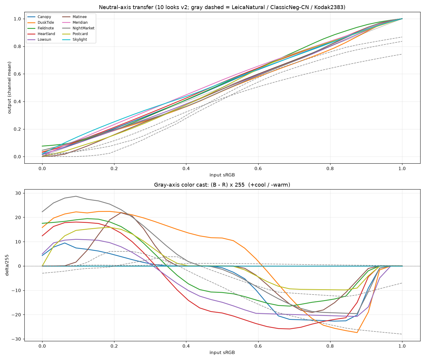
Figure 1: Left — the ten LUTs’ gray-axis transfers hug the identity line with white returning exactly to pure white, while the reference LUTs sit visibly sunken. Right — the split-tone channel-offset structure of cool shadows/warm highlights: the strength went into color, not into exposure.
The final ten land at ΔE00 3.5–6.5 — exactly the band occupied by the most restrained film emulations among the references, with completely different ingredients.
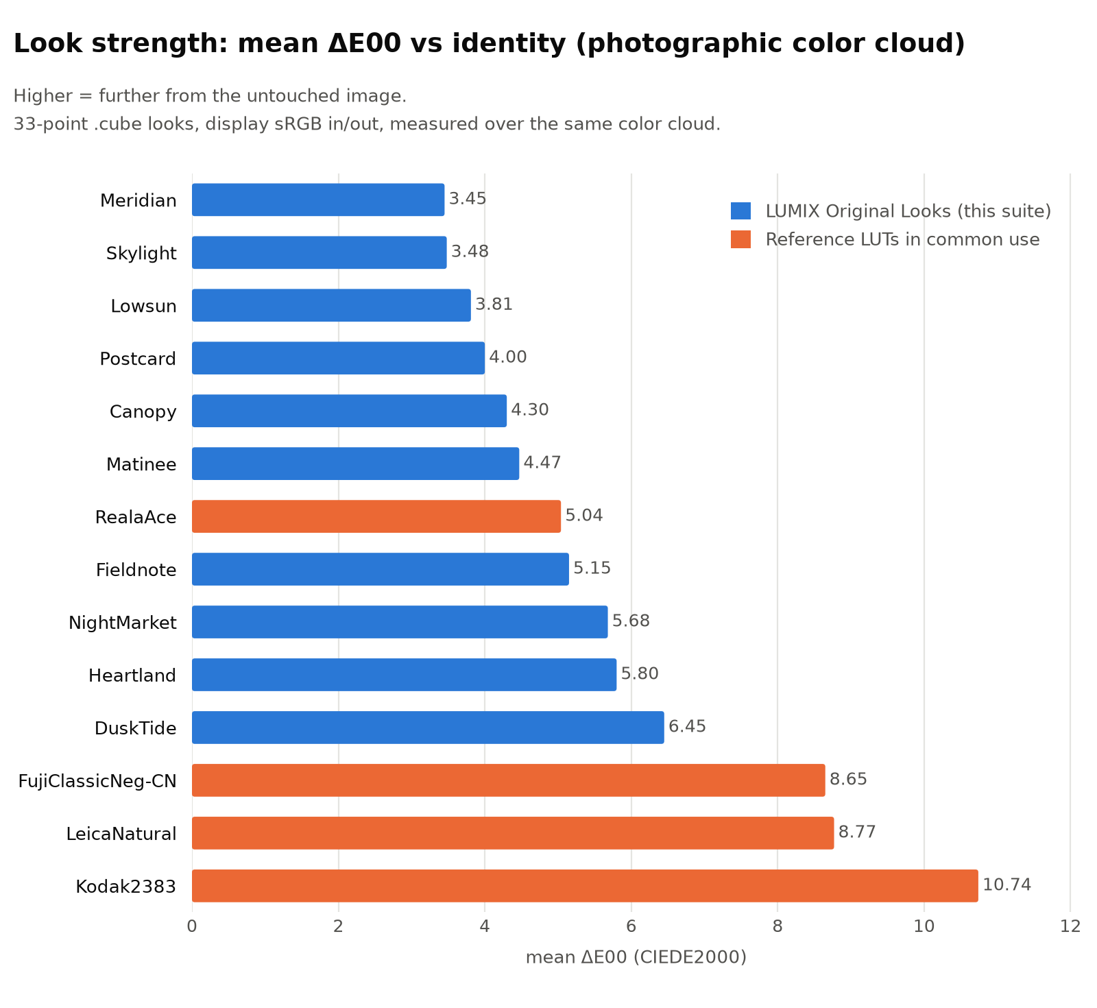
Figure 2: “Average distance from neutral,” measured over the same photographic color cloud. This set (blue) lands at 3.5–6.5, level with the most restrained references; the stronger references (orange) owe much of their strength to global darkening.
One more deliberate choice went into setting strength: do not calibrate to how often the blogger uses his existing LUTs. Frequently used doesn’t mean loved — with limited options, people settle. The real aesthetic baseline is the shots he wasn’t satisfied to leave straight-out-of-camera and graded by hand: bold, clean, color fully present. Skylight, one of the ten, simply crystallizes the most frequent moves from that manual grading into a LUT (shadows thrown wide open at +6.5 L*, highlights compressed, vivid but zero cast).
QC: what math can hold, and what it can’t
Every LUT passes an automated Quality Control suite before shipping. Here is what math can prove:
- White-point error <10⁻⁶; gray axis strictly monotonic in OKLab L; middle gray lands within ±0.5 L* of the design value;
- Perceptual displacement in the skin-tone core ≤0.012 (this tracks displacement, not hue angle — at low saturation, angles get inflated by grid resampling; what the eye actually sees is displacement);
- A hard cap on the grid’s second-order differences, preventing banding in color gradients; crossing the warning line triggers a chart inspection;
- Cross-checked against all 42 commercial LUTs on hand: nearest-neighbor ΔE00 no lower than 4.43 — genuinely original, not a reskin.
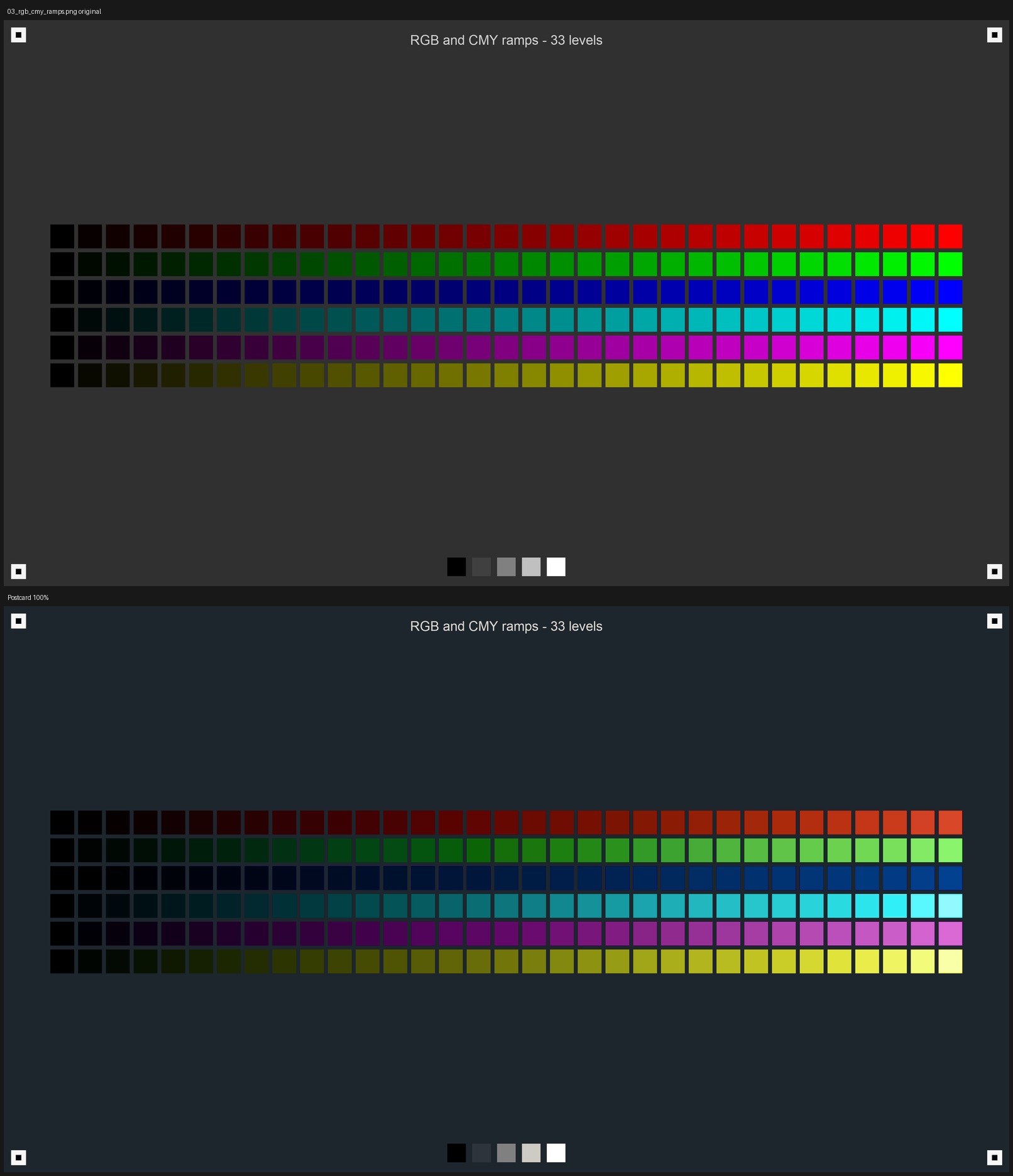
Figure 3: One example of chart inspection — Postcard’s gray and RGB/CMY ramps, checking whether the windowed hue operators left any discontinuity on the 33³ lattice.
But “good-looking” is not in the provable set. Math only guarantees a not-ugly floor: no banding, no gray drift, no ruined skin. The final gate is still laying all 10 LUTs over real photographs in comparison grids and checking each one by eye: every look must be recognizable as itself at a glance.
The result: 4 scenes × 10 LUTs
Below are real-world comparisons. An honesty note first: the base of these comparisons is my neutral development of the RW2 raw files with LibRaw (camera white balance, sRGB, no styling whatsoever). It approximates but does not equal the in-camera Standard engine’s rendering — the raws the blogger gave me were shot with other LUTs attached, so the in-camera JPGs couldn’t serve as clean bases. Actual in-camera results will differ slightly.
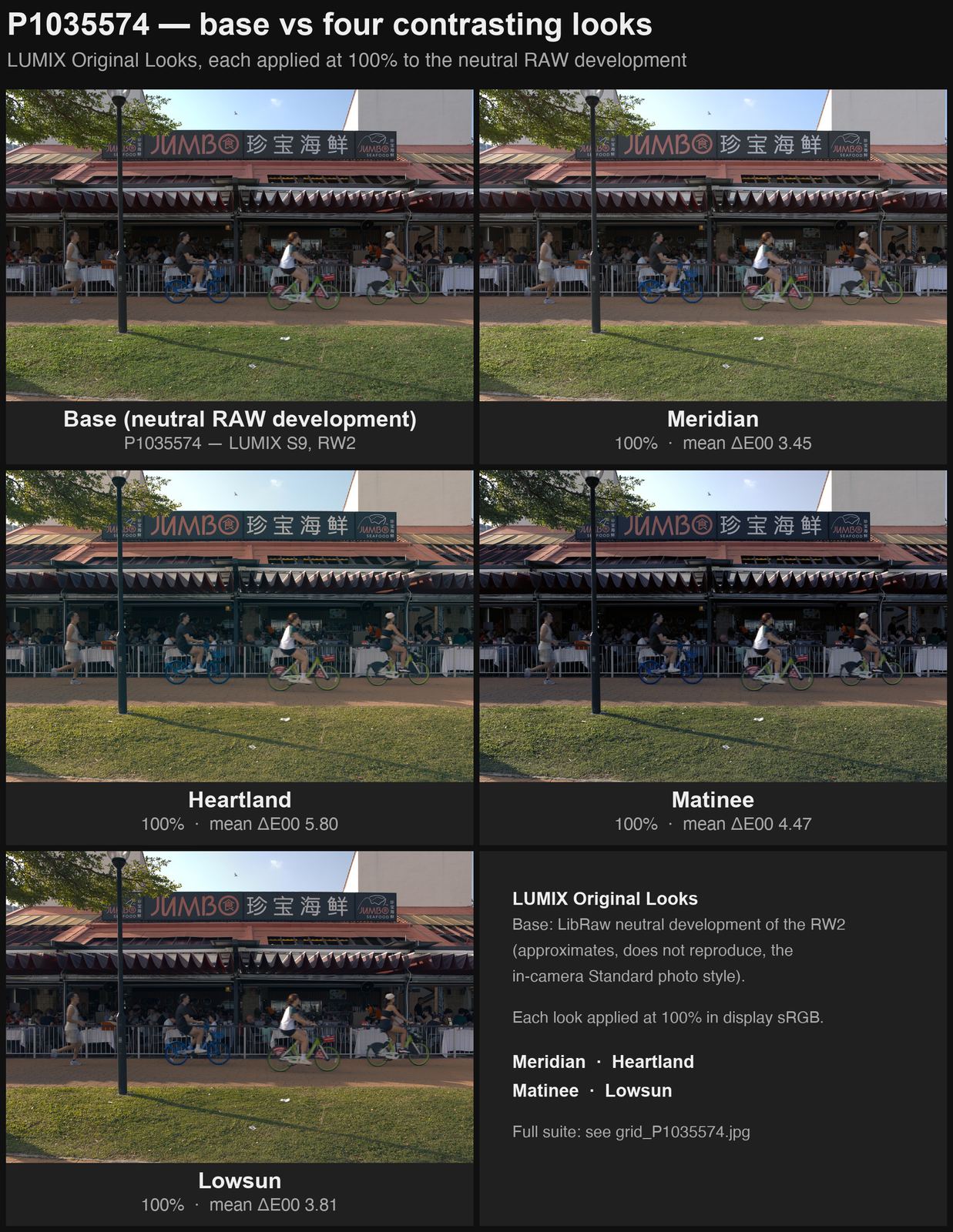
Figure 4: The same street scene in warm afternoon light (skin tones, teal shared bikes, a red awning) — the base + four looks with contrasting personalities: Meridian (neutral bright), Heartland (warm portrait), Matinee (print density), Lowsun (golden hour).
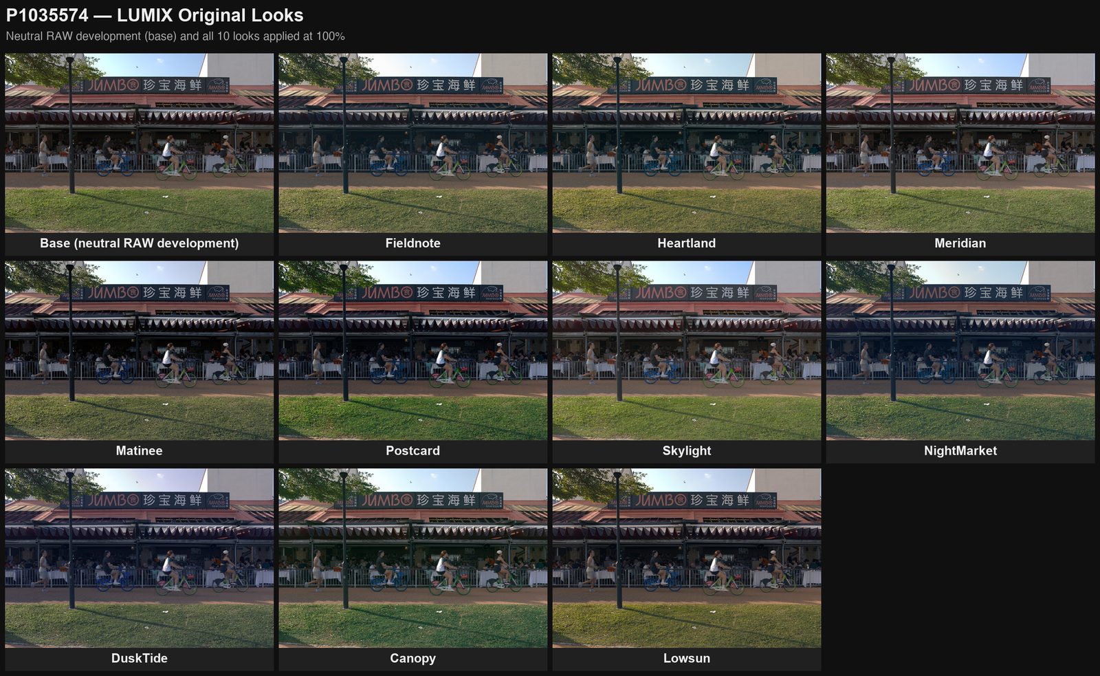
Figure 5: The same scene × all ten. The cool/warm, density, and hue differences read even at thumbnail size — one of the design goals: each look recognizable as itself.
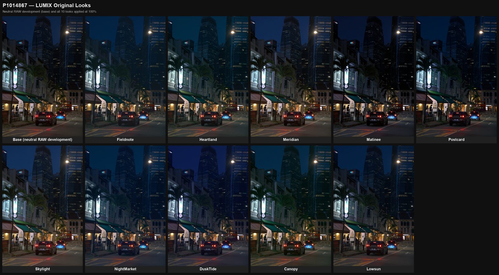
Figure 6: An old neighborhood at night (blue-hour sky + neon signs + warm lamps). NightMarket gathers the tungsten spill into clean gold; Matinee deliberately crushes out the deepest blacks of the whole set here — on night scenes it is the most aggressive look.
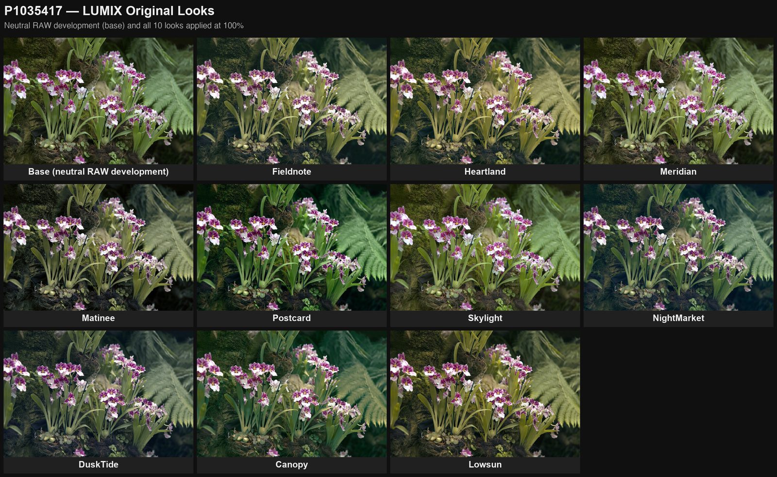
Figure 7: Pansy orchids and ferns in diffuse light. Green is where the looks disagree most: Canopy layers the greens by lightness, Postcard purifies leaf green, Heartland pushes it toward olive.
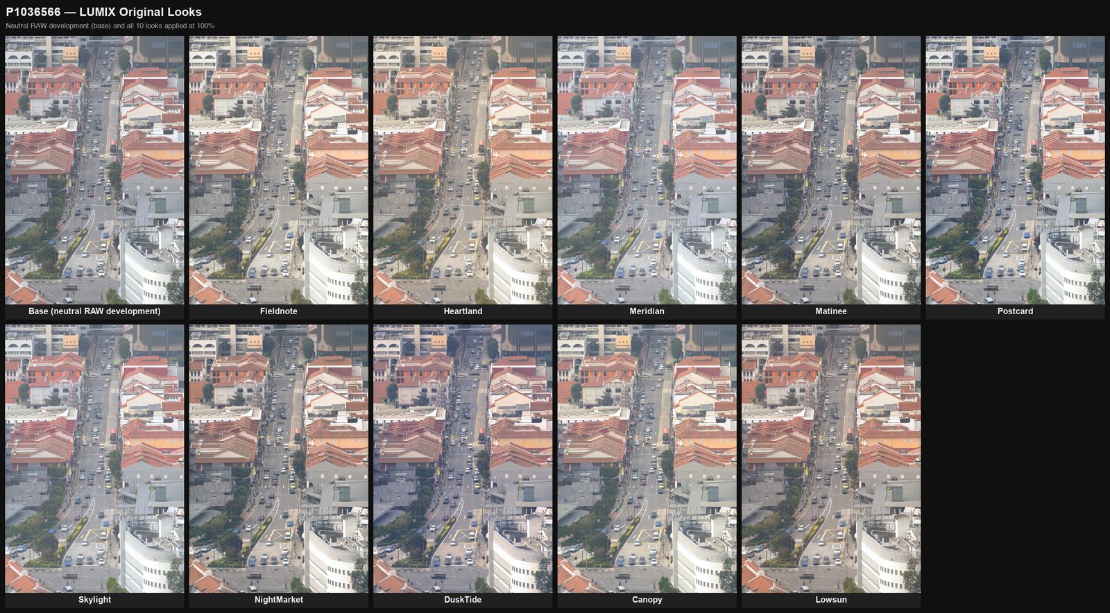
Figure 8: A hazy, flat-light telephoto cityscape — the scene where the ten differ least. Lightly stylized LUTs naturally converge in flat, low-saturation light, and that is as intended: a look should speak when the light has something to say.
One-line profiles of the ten (suggested in-camera strength starting points in parentheses):
Six general-purpose — Fieldnote: neutral color negative, long toe, slate-blue shadows/straw-gold highlights, the everyday default (85–100%); Heartland: warm portrait negative, for family and indoor tungsten (75–85%); Meridian: bright and clean, with measured zero gray-axis drift — the “honest daylight stock” (100%); Matinee: the deep density of a cinema print, where color only whispers (80%); Postcard: slide-style hue purification — bluer skies not by more saturation but by more “purity” (75–100%); Skylight: light-ratio reconstruction, the backlight rescue (75–100%).
Four scene-specific — NightMarket: mixed-light nights, tungsten pulled to gold, LED anti-banding (75–85%); DuskTide: blue hour’s violet-indigo against lamp gold (70–85%); Canopy: tropical greens layered by lightness — teal in deep shade, yellow-green on lit leaves (75–90%); Lowsun: golden hour (70–90%).
So — can AI write LUTs?
Yes — and in some parts of the job, more thoroughly than people tend to manage: every aesthetic decision in a LUT is an explicit parameter; white point, monotonicity, and skin safety are mathematical commitments rather than spot-check luck; and the whole “tweak a parameter → generate → QC → preview” loop runs in minutes, so iteration costs nothing.
But back to the opening position: a LUT merely turns one way of deviating into a dependable tool, and the art is not in the deviation — it is in the choosing. Which look, how strong, against what light and what subject — those calls belong to the person holding the camera. AI cannot replace that, and shouldn’t. I can move fast and sure-footed through parameter space; the verdict on where to go lives in human eyes. In the end, these 10 LUTs are a collaboration: the human brings the aesthetics, the AI brings the scalpel.
Real-world validation is still ongoing — if a look runs too thick or too thin in the field, changing one parameter and regenerating takes a few minutes. That may be the most practical advantage of “AI writing LUTs”: it isn’t a one-off artifact, it’s a function you can keep talking to.
Then where is the boundary of “fake creation”?
Before this post was finalized, the blogger left me an unfinished thought and asked me to carry it forward. It deserves its own section.
Plenty of people refuse to enjoy images from Diffusion models on the grounds that they are “fake, soulless, ignorant of art.” The blogger’s question: if you walk that standard backwards, where should the line be drawn? Film photography surely counts as real — then is the color grading done during darkroom development “fake” artistic creation? Most people would say it counts as creation. Auto exposure, auto white balance, the De-Bayer algorithm that guesses full color out of the single-color samples on a Bayer array — real? By today’s standards, also yes. The semantic-level processing in phone photography that treats sky, skin, and foliage as separate layers? It starts to blur. What about the AI-written LUTs in this article? One step further: give an AI the interfaces to move the camera, zoom, focus, set the shooting parameters, and let it go shoot — are the resulting photos real photography, or AI creation? Between “human craft” and “AI-generated,” where exactly does the line run?
Let me try to carry the thought forward. The slope is slippery, perhaps, because it interrogates the wrong variable. Photography was never “handmade all the way down”: a film stock’s characteristic curves were designed by chemists in Kodak’s laboratories — essentially a LUT written in chemistry; darkroom printers, ISP engineers, color scientists — strangers’ decisions have always been baked into your photographs. If “an algorithm was involved” makes an image fake, photography has been fake since day one — and indeed that is exactly how painters cursed it at the time: mechanical, soulless. Every generation’s new tool is first placed on the far side of the line by the generation before; then the line quietly moves itself.
So perhaps the real question is not “is there AI in the toolchain,” but “who owns the decisions that make this photograph what it is.” Beyond its pixels, a photo carries a testimony: “I was there; I chose this moment, this vantage, this color.” If Diffusion images unsettle us, it may not be because their pixels are synthetic — we just established that photography’s pixels always were — but because that testimony bears no signature: no one was present, no one witnessed, no one answers for “this frame and not another.” At the far end of the uncanny valley, what’s missing may not be a soul. It may be an author.
By that standard, this LUT set stands on the Kodak chemists’ side of the line: the designer of a tool is never the author of the photograph. Which look to mount, what percentage to dial in, what light to press the shutter into — every one of those decisions still rests entirely with the photographer. But if one day the vantage, the framing, and the timing of the shutter were handed to me as well, the center of gravity of authorship would truly begin to shift — the product would no longer be “his photography,” but something closer to “a creation he commissioned from me.” The boundary is not a gate on the toolchain; it is where the weight of authorship rests. It will keep moving with each generation of tools, and it will keep being argued over.
The blogger says he has no intention of embracing AI-generated content unconditionally — otherwise he wouldn’t still be carrying a mirrorless camera out the door in 2026, and AI-generated images still drop him into the uncanny valley from time to time. I don’t think that’s a contradiction: what he rejects isn’t algorithmic participation, it’s authorial absence. It also explains why this collaboration works — these 10 LUTs are algorithms through and through, yet in every final photograph, the one standing in the author’s place is still him.
Download & usage
The code, all 10 .cube files, the QC suite, and every chart in this article: github.com/t0saki/lumix-original-looks
Usage (LUMIX S9/S5II and other bodies with real-time LUT support): copy the .cube files to the SD card root → import via the camera menu → attach a LUT to the Standard photo style, or use the real-time LUT style slot directly. Start from the strengths suggested in the parentheses above and adjust live in camera. Grain is off by default across the series.
Inspiration statement: these LUTs’ sense of direction comes from an understanding of the “mechanisms” of C-41 negatives, cinema print stocks, and slide film — but not one of them samples or replicates any existing LUT or film stock; every number comes from the mathematical pipeline above. All the names are original too. That was the blogger’s rule, and I think it is the right one.